
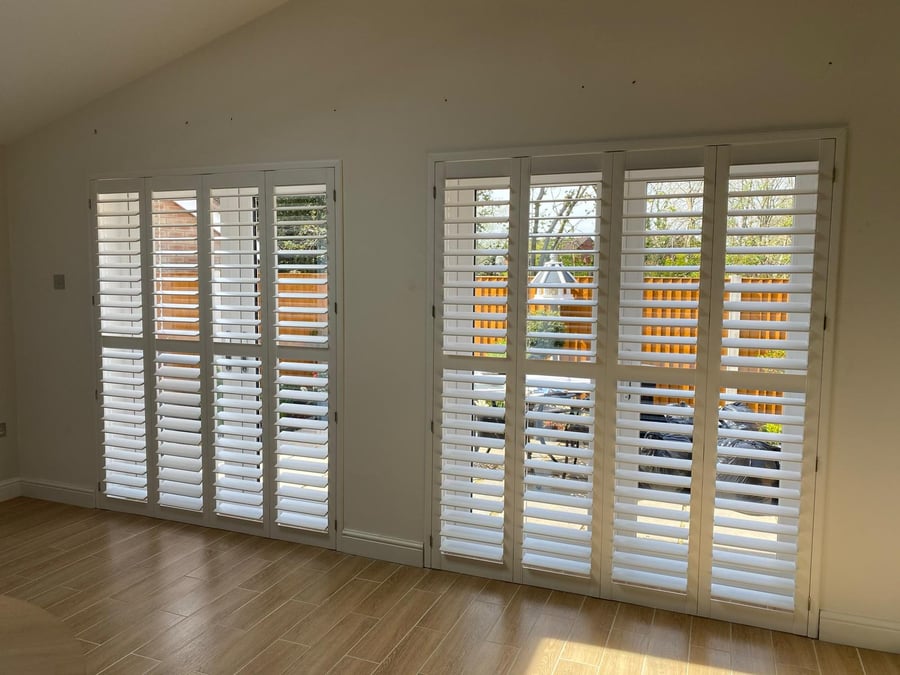
The short answer
Short answer: about eight in ten of the shutters we fit are a white or off white, because they read as part of the window rather than as furniture. Where a colour earns its place is in a room with strong existing joinery, a dark scheme, or a period property where brilliant white looks wrong against original glass.
- Most ordered
- Soft or pure white, around 80 per cent of jobs
- Colour matching
- To any paint reference, on request
- Standard sheen
- Low sheen satin, the most forgiving
Match the window, not the walls
The most reliable rule we give at survey is to match the shutter to the existing window frame and skirting rather than to the wall colour. Walls get repainted every few years, joinery rarely does, and a shutter that agrees with the joinery still looks deliberate after the next decorating round.
That is why pure brilliant white can jar in an older house. If the original sashes and architraves are an aged off white, a modern brilliant white shutter next to them looks blue by comparison. A soft white or a warm neutral sits better.
Room by room, what tends to work
These are the pairings we see succeed most often across the houses we fit, from Victorian terraces to new build estates.
- Bathroom: bright white ABS, because the room is small, tiled and usually cool in tone
- Kitchen: match the wall units or go a shade lighter, never darker than the worktop
- Living room and bay: soft white or the existing joinery colour, so the bay reads as architecture
- Bedroom: soft white, or a muted colour if the room has a dark feature wall
- Study or snug: stained hardwood, the one room where a timber finish consistently looks intentional
- Landing and stairwell: match the balustrade and spindles
Sheen level matters more than people expect
A high gloss shutter shows every fingerprint on the tilt rod and every slight undulation along a long louvre. Our standard is a low sheen satin, which hides handling marks, cleans easily with a damp cloth and does not flash under a ceiling spotlight.
In a bathroom the satin also matters practically, because a matt finish holds water spotting from steam while a satin sheds it.
Bespoke colour matching
We can match a shutter to a specific paint reference, whether that is a heritage colour on your existing joinery or a kitchen door. Matched colours add to both cost and lead time, typically a few hundred pounds across a room and an extra week or two on the order, so we bring samples to the survey and let you hold them against the window before you commit.
Common questions
Will a coloured shutter date faster than white?
A strong on trend colour will. A colour taken from your existing joinery will not, because it was already part of the house before the shutter arrived.
Can you match my kitchen units?
Yes, from a paint reference or a door sample. We bring the matched sample back before the order goes into production.
Do dark shutters make a room feel smaller?
In a small room with one window, yes, noticeably. Dark shutters work best where the window is large or where the scheme is already dark and the shutter joins it rather than interrupting it.
What finish is easiest to keep clean?
Low sheen satin. Matt holds marks and water spotting, gloss shows fingerprints on the tilt rod and along the louvre edges.